
 Call Us : (917) 410-4001
Common Interior Formatting Mistakes That Get Manuscripts Rejected
Key Takeaways
- Most formatting mistakes are invisible to the author but obvious to readers, and some get your file rejected by KDP.
- The usual culprits: inconsistent fonts and headings, wrong margins or bleed, widows and orphans, missing front matter, and low-res images.
- Print is unforgiving (what you upload is what prints); eBooks break when you format them like a printed page.
- Clean interior formatting signals professionalism, sloppy formatting triggers refund requests and bad reviews.
- Most of these are quick to prevent with a proper template, or to eliminate by using a professional formatter.
You can write a brilliant book and still have it look amateur, or get rejected on upload, because of interior formatting. These mistakes are sneaky: you stop seeing them after staring at your manuscript for months, but readers and retail systems spot them instantly. Here are the most common interior formatting mistakes that get manuscripts rejected (or quietly hurt sales), and how to fix each one.
1. Inconsistent Fonts and Headers
Mixing fonts, sizes, and heading styles is the fastest way to look amateur. Chapter titles that don’t match, body text that switches typefaces, or random bold and italic choices all signal “homemade.” Fixes: pick one clean body font and one heading style and apply them consistently using paragraph styles (not manual formatting). Every chapter opener should look identical; every subheading should follow the same rule.
2. Wrong Margins and Bleed for Print
Print is unforgiving. Margins that are too tight let text disappear into the binding; a missing gutter makes the inner text unreadable; adding bleed when you don’t need it (or omitting it when you do) gets files flagged. Remember the gutter margin grows with page count. If you’ve had a file bounced, this is the first thing to check, see our KDP formatting checklist for the exact numbers.
3. Orphaned Headings, Widows, and Orphans
These typographic gremlins quietly cheapen a page:
- Widow: the last line of a paragraph stranded alone at the top of a page.
- Orphan: the first line of a paragraph stranded alone at the bottom of a page.
- Orphaned heading: a chapter or section heading at the very bottom of a page with its text on the next.
Professional layouts control these with widow/orphan settings and “keep with next” rules so headings never separate from their text. They’re small, but together they’re the difference between “typeset” and “word-processed.”
4. Missing Front Matter Elements
A book that jumps straight into chapter one with no title page or copyright page looks incomplete, and a missing copyright page is a genuine professional and legal oversight. At minimum include a title page and a copyright page; most books also want a dedication and a table of contents (required and linked for eBooks). Getting the order right matters too, follow the conventional sequence rather than improvising.
5. Image Resolution Issues
Images that look fine on your screen can print blurry or pixelated. Print requires 300 DPI at the size the image will appear; low-res images are a frequent rejection and refund trigger. For eBooks, images must be high enough resolution to look sharp on modern high-density screens, but properly sized so they don’t bloat the file. Never enlarge a small image to fill space, it only magnifies the blur.
| Mistake | Why it’s a problem | Fix |
|---|---|---|
| Inconsistent fonts/headings | Looks amateur | Use paragraph styles consistently |
| Wrong margins/bleed | File rejected; text in binding | Match gutter to page count; correct bleed |
| Widows & orphans | Cheapens the page | Enable widow/orphan + keep-with-next |
| Missing front matter | Looks incomplete; legal gap | Add title + copyright + TOC in order |
| Low-res images | Blurry print; rejections | Use 300 DPI at display size |
Stop guessing at formatting.
Prime Publishing Hub formats clean, professional interiors for print and eBook, no widows, no rejected files, no low-res surprises. Get a free formatting quote.
Get a Free Formatting Quote“Why Was My Book Rejected on KDP?”
If KDP bounced your file, it’s almost always one of the above: margins or gutter too small, bleed wrong, low-res images, or content outside the safe area. Work through them in order, and if you’re still stuck, the fastest fix is a professional formatter who’ll deliver a compliant file the first time. (Not sure which file types you even need? See EPUB vs. MOBI vs. PDF.)
How Prime Publishing Hub Helps
Prime Publishing Hub’s book formatting and interior layout services eliminate every mistake on this list, consistent typography, correct margins and bleed, controlled widows and orphans, complete front matter, and properly resolved images, delivered as clean print and eBook files that upload without a hitch.
Want a flawless interior? Request a free quote or talk to our formatting team.
Frequently Asked Questions
What are the most common book formatting mistakes?
Why was my book rejected on KDP?
What are widows and orphans in book formatting?
What front matter does a book need?
Can Prime Publishing Hub fix my book's formatting?
Keep Reading
eBook vs. Print Cover: Dimensions, Specs, and Design Differences
Your eBook and print covers aren’t the same file resized. Here are the exact dimensions and specs for each, eBook size, wraparound anatomy, spine math, bleed, and KDP vs. IngramSpark.

KDP Formatting Requirements: A Complete 2026 Checklist
Formatting is where amateur books give themselves away, and where KDP uploads get rejected. This complete 2026 checklist covers print and eBook specs, matter order, and rejection reasons.
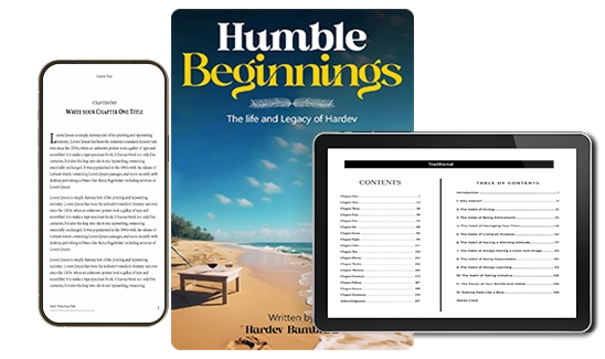
EPUB vs. MOBI vs. PDF: Which Format Do You Actually Need?
EPUB, MOBI, PDF, the eBook format soup confuses every new author. Here’s what each is built for, which retailers want which, and why you probably need fewer formats than you think.