
 Call Us : (917) 410-4001
What Makes a Book Cover Sell? Genre-by-Genre Design Rules
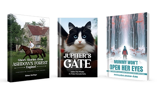
Key Takeaways
- A cover that sells signals the right genre instantly, readers decide in a thumbnail whether your book is “for them.”
- Genre conventions matter more than personal taste; your cover’s job is to meet reader expectations, not express your art.
- Each genre has visual codes: romance leans on couples and warmth, thrillers on bold type and tension, fantasy on epic worlds.
- Your cover must work as a tiny thumbnail first, where most readers actually see it, so test it small.
- A professional, genre-appropriate cover is one of the highest-return investments in self-publishing.
Readers really do judge a book by its cover, and they do it in about a second, as a thumbnail the size of a postage stamp. Your cover isn’t decoration; it’s your single most important marketing asset. A cover that “sells” does one job brilliantly: it tells the right reader, at a glance, “this is exactly the kind of book you love.” Here’s how covers do that, genre by genre, and how to design one that earns the click.
Why Genre Conventions Matter More Than Personal Taste
This is the hardest lesson for new authors: your cover is not for you, it’s for your reader. Genres have visual “codes” readers have learned over thousands of books. When your cover matches those codes, browsers immediately understand what they’re getting and feel safe buying. When it ignores them, even a beautiful cover confuses readers and they scroll past. The goal isn’t originality for its own sake, it’s fitting your genre while standing out within it. Study the top 20 bestsellers in your exact category; the patterns you see are your brief.
Romance Cover Trends
Romance is a huge, sub-divided market, and covers signal the sub-genre precisely. Contemporary and rom-com lean on bright colors, illustrated/cartoon couples, and playful hand-lettered titles. Steamy and dark romance use photographic couples, moody lighting, and bold serif type. Across the board, romance covers promise emotion and a specific heat level, get the sub-genre cues wrong and you attract the wrong readers (and the wrong reviews).
Thriller and Mystery Cover Trends
Thrillers and mysteries sell tension. Expect large, bold typography (often bigger than the image), high-contrast color schemes, and a single ominous focal element, a lone figure, a dark road, a house, fog. The title usually dominates so it reads at thumbnail size. The feeling to evoke is unease and momentum: something is wrong, and you need to find out what.
Nonfiction and Business Book Cover Trends
Nonfiction covers sell clarity and authority. They’re typically clean and type-driven, with a strong, benefit-led title and subtitle, limited color palettes, and plenty of white space. For business and self-help, the title does the heavy lifting (it’s often the “hook”), and the design conveys credibility and confidence. Cleverness is fine; confusion is fatal, a reader should grasp the book’s promise in seconds.
Fantasy and Sci-Fi Cover Trends
Fantasy and science fiction covers sell world and scale. Fantasy often features epic landscapes, symbolic emblems or sigils, ornate title treatments, and rich, atmospheric color. Sci-fi leans into sleek, futuristic type, technology, space, and cooler palettes. Both genres promise immersion in another world, and readers expect production values that match the ambition of the story.
| Genre | Visual cues | Title style |
|---|---|---|
| Romance | Couples, warmth, sub-genre heat cues | Script or bold serif |
| Thriller / Mystery | High contrast, single ominous element | Large, dominant |
| Nonfiction / Business | Clean, type-driven, white space | Benefit-led, bold |
| Fantasy / Sci-Fi | Epic worlds, emblems, atmosphere | Ornate or futuristic |
How to Thumbnail-Test Your Cover
Most readers first see your cover as a thumbnail in search results, so design for that reality:
- Shrink it. View your cover at about 150 pixels wide. Is the title still readable? Does the image still read clearly?
- Put it in a lineup. Place it beside the current bestsellers in your category. Does it belong, and does it stand out, or does it look amateur next to them?
- Squint test. Blur your eyes. The strongest covers still communicate genre and mood even when fuzzy.
- Ask the right people. Show it to readers of your genre, not just friends and family, and ask what genre they think it is.
If your cover fails the thumbnail test, it’s costing you sales no matter how nice it looks full-size. (For the bigger picture on why design drives revenue, see why professional layout and cover design impact sales.)
Want a cover that sells, not just looks nice?
Prime Publishing Hub designs genre-accurate, thumbnail-tested covers that earn the click and fit your market. Get a free design consultation.
Get a Free Cover ConsultationCommon Cover Mistakes That Kill Sales
- Wrong genre signals. A literary-looking cover on a thriller (or vice versa) attracts the wrong readers.
- Title too small to read as a thumbnail. If it disappears at 150px, it disappears in search.
- Too many fonts or effects. Amateur covers try to do everything; pro covers do one thing well.
- Stock images everyone uses. Recognizable stock photos make your book look generic.
- Ignoring the comps. Designing in a vacuum instead of studying what sells in your category.
How Prime Publishing Hub Helps
Prime Publishing Hub’s book cover design service starts with your genre and your market, not guesswork. We study the comps, design covers that signal the right genre and stand out at thumbnail size, and make sure your interior layout and formatting match the professional impression your cover sets. (Briefing a designer? Our cover brief guide shows you how to get it right.)
Ready for a cover that converts? Request a free quote or talk to our design team.
Frequently Asked Questions
What makes a book cover sell?
Why do genre conventions matter so much for book covers?
How do I test if my book cover works?
What are the most common book cover mistakes?
Can Prime Publishing Hub design a cover that sells?
Keep Reading
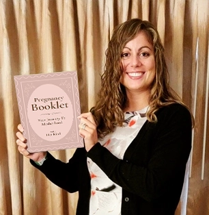
Before & After: How Cover Redesigns Improved Book Sales
Sometimes a good book just won’t sell, and the cover, not the writing, is the problem. Here’s how cover redesigns lift sales, with a before-and-after breakdown and an A/B testing guide.

How to Repurpose Your Book: From eBook to Audiobook, Print, and Even Screenplay Adaptations
Your manuscript is worth far more than one format. Here’s how to repurpose a single book into eBooks, audiobooks, print, translations, and screen adaptations to reach new readers.
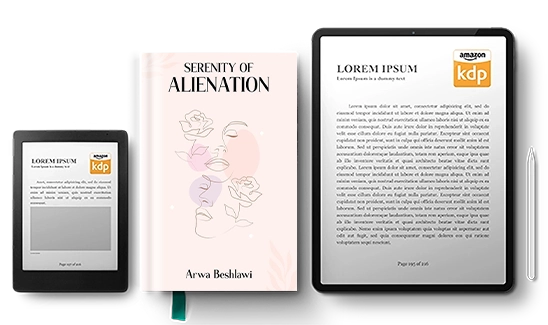
How to Make Your Book Shine on Amazon: A Simple Guide for New Authors
Publishing on Amazon is easy; getting noticed isn't. This simple guide shows new authors how to optimize keywords, categories, cover, blurb, and reviews so your book stands out.